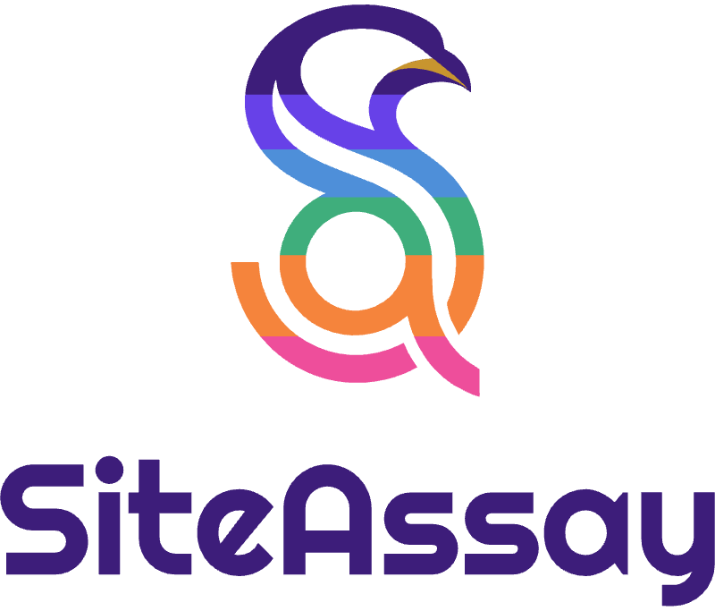
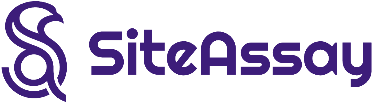
Primary lockup
The default. Use it on white, paper and any light ground.
Brand assets
The logo, colours, type and product imagery, with the rules for using them and every file to download. Writing about us, listing us as a partner or building an integration? Start here.
Logo
The mark is a double-line S that rises into a raptor's head, with a lowercase a in its lower bowl and the a's stem stepping through as the leg. It watches, which is what an audit does. The name beside it is set in Righteous and is always one colour, so the mark carries the colour and the name stays calm.
The default. Use it on white, paper and any light ground.
For night and other dark grounds.
For the brand violet only.
For square and narrow spaces: badges, posters, merchandise.
The stacked lockup for dark grounds.
The stacked lockup for the brand violet.
The raptor on its own, where the name is already nearby.
The mark for dark grounds.
The mark for the brand violet.
The square icon for app stores, avatars and favicons.
The name alone, for credits and partner listings.
The name alone, for dark and violet grounds.
Single-colour print, embossing and engraving on light stock.
Single-colour print, photography and video overlays.
Keep a margin around the logo equal to a quarter of the mark's height, the size of the raptor's head. Nothing else, including other logos and the edge of the page, comes inside it.
Below these sizes the bands close up. Use the mark alone, or the app icon, when the space is smaller.
Colour
Violet and paper carry the brand. The spot colours are for illustration and for results, where a colour means pass, warn or fail, and they are the six bands of the mark from head to foot.
The brand colour: the wordmark, primary buttons and headings.
Accents, links and the second band of the mark.
The dark ground for the mark and for dark mode.
The light ground. Warmer than white, and the default page.
Quiet fills, selected states and the head of the mark on dark.
The beak plane of the mark. Gold is used sparingly, and only for meaning.
Illustration, charts and the third band.
Passing results and the fourth band.
Warnings and the fifth band.
Failures, highlights and the sixth band.
Calls to action on violet, and eyebrows on dark.
Typography
All four are open source and free to use. Righteous belongs to the name alone; the other three set everything else, on the site and in the product.
SiteAssay
The brand name in the logo, and nothing else. Never set headlines or body copy in it.
Diagnose. Prove. Close.
Headlines, page titles and pull quotes, always set large.
Every finding comes with the evidence printed beside it.
Body copy, the product interface, tables and forms.
SCORE 72 / 100
Eyebrows, buttons, check identifiers, code and any number compared down a column.
Icons and elements
Line icons on a 24-unit grid with round caps, the offset tile, and pastel tints. They are what makes a SiteAssay page recognisable before the logo is in view.
A rounded square with a hard shadow set down and to the right. Used for icons, feature tiles and illustration. Never a blurred shadow.
Each card in a row takes a different pastel, so a grid reads as one composition. The tints follow the theme and land correctly on paper and on night.
Product imagery
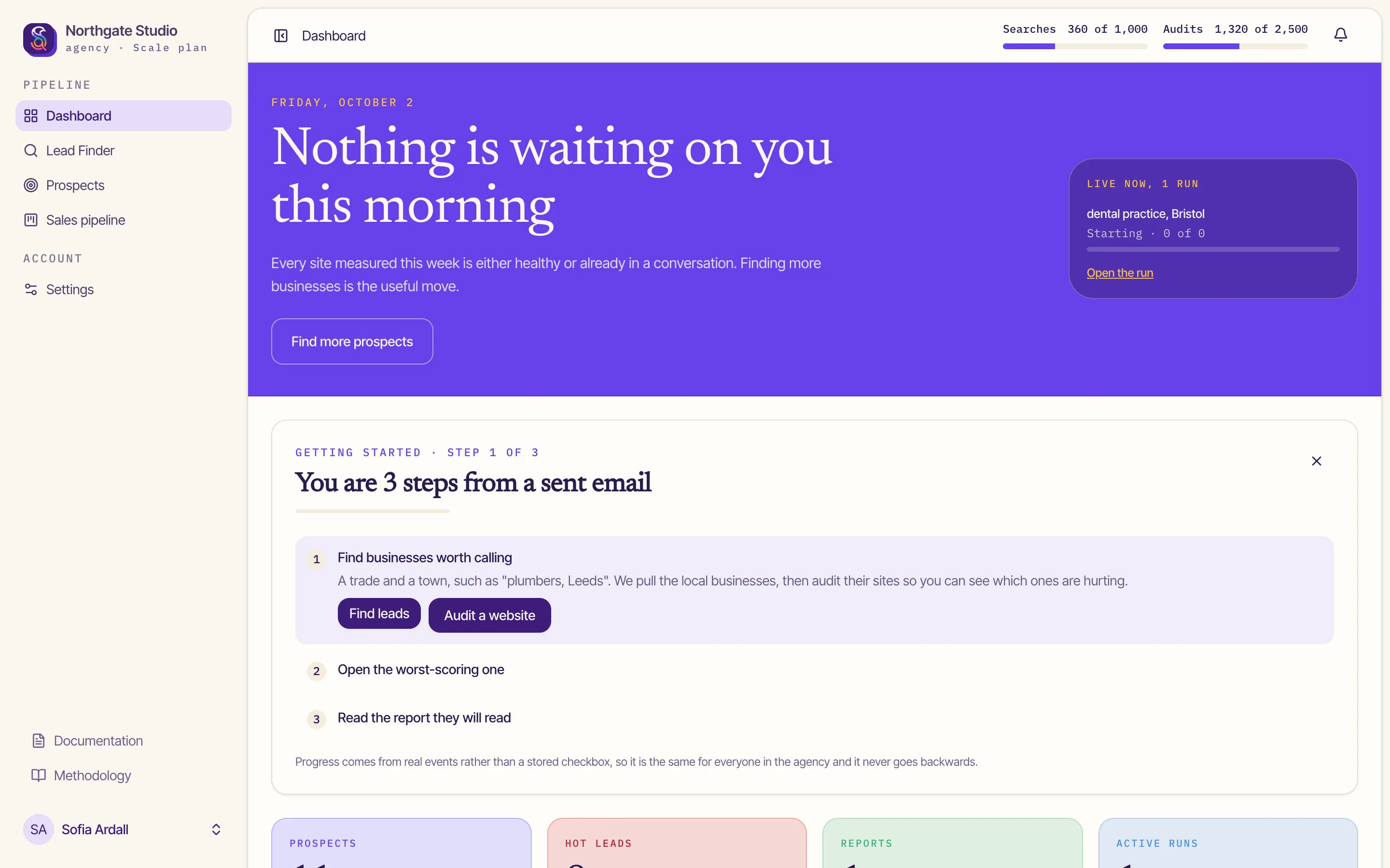
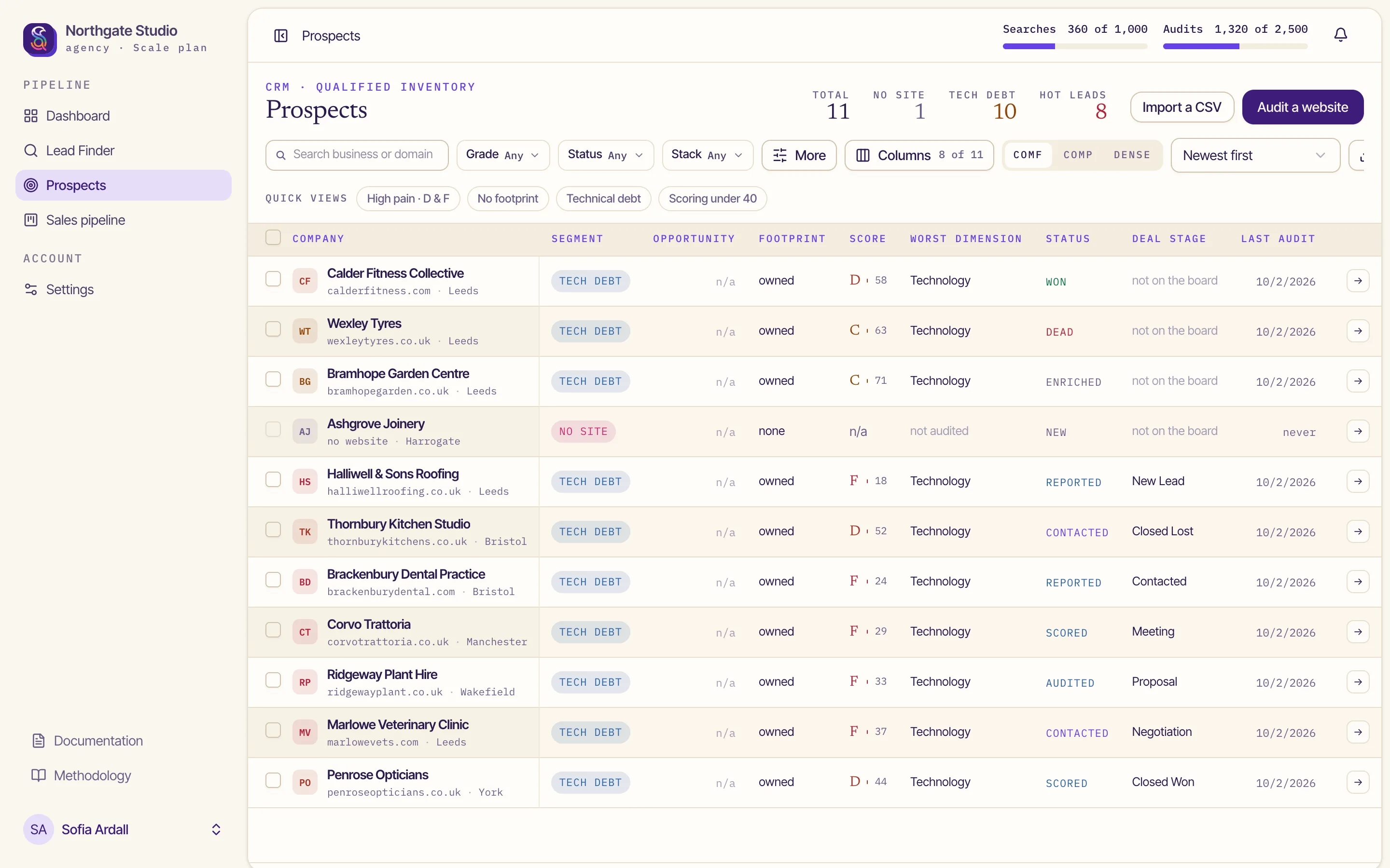
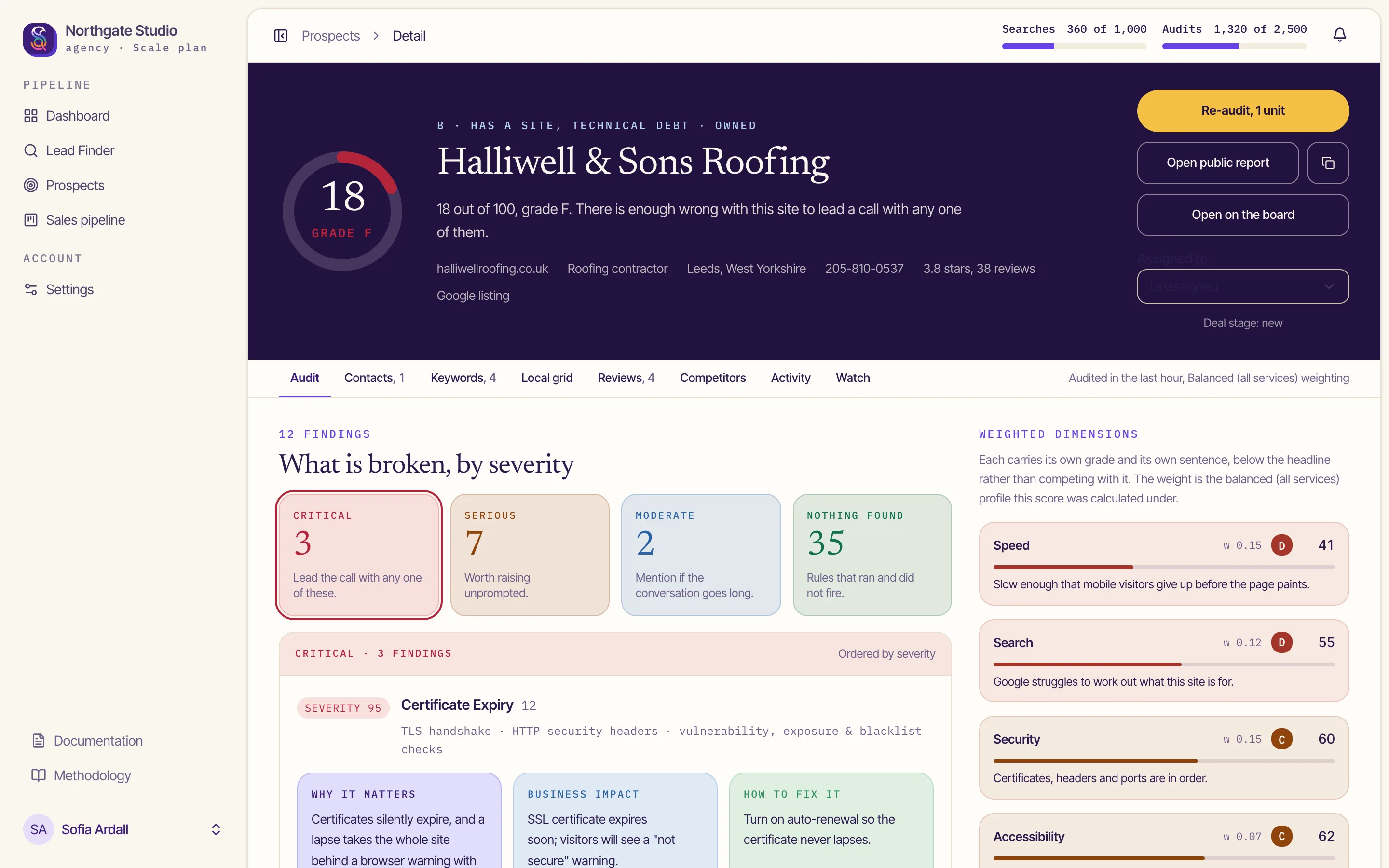
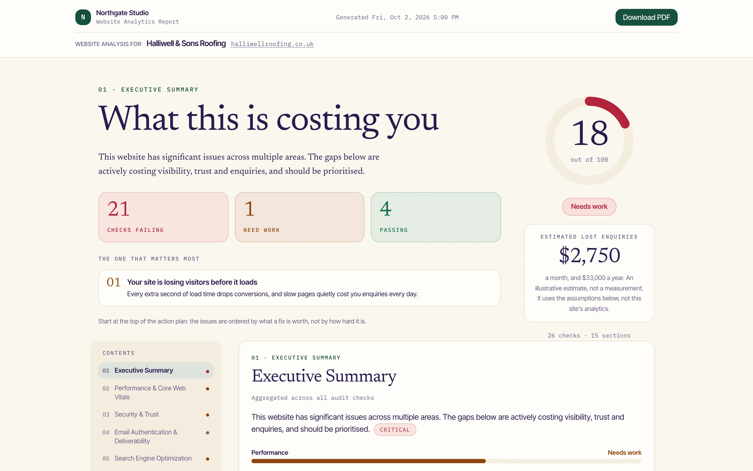
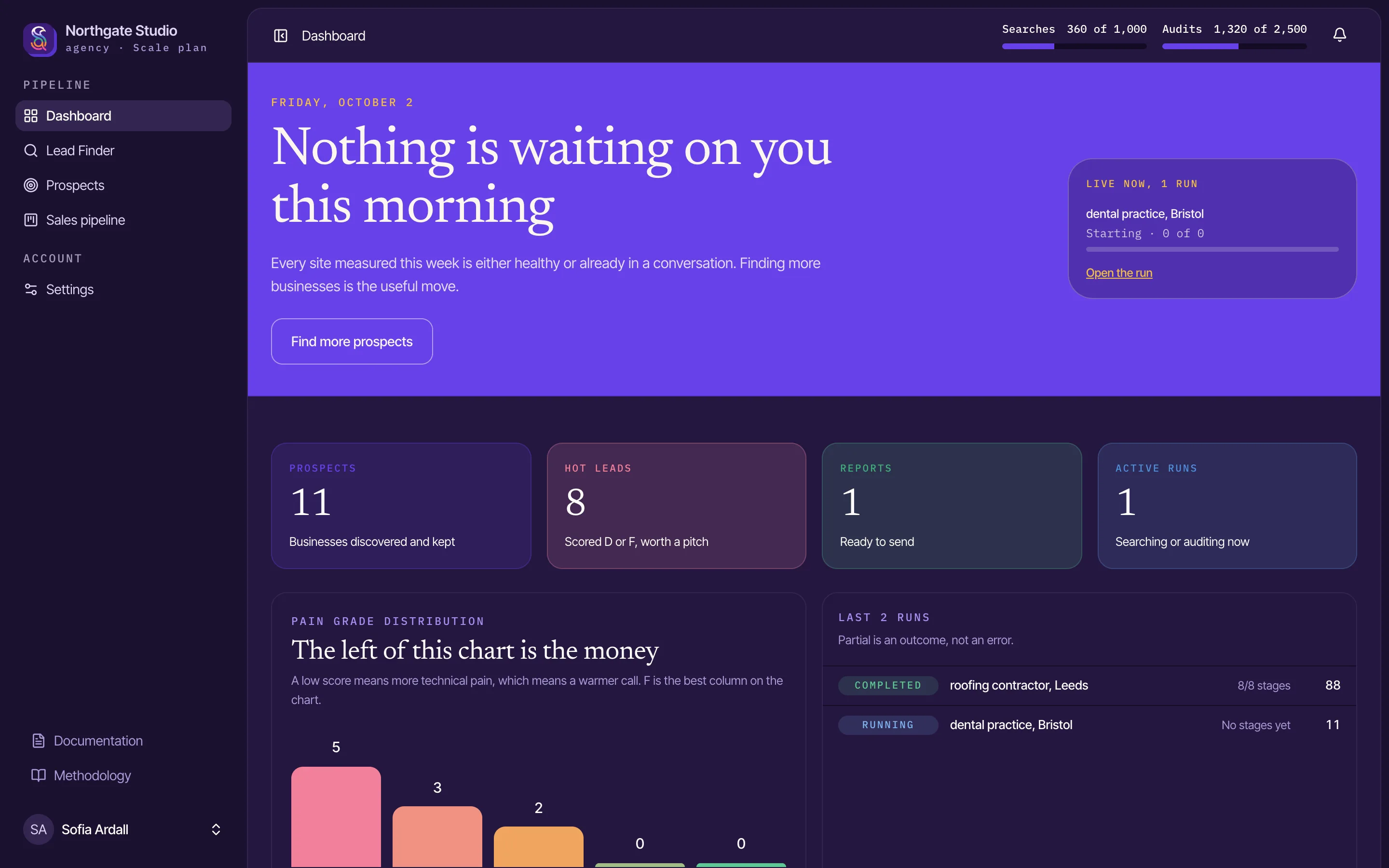
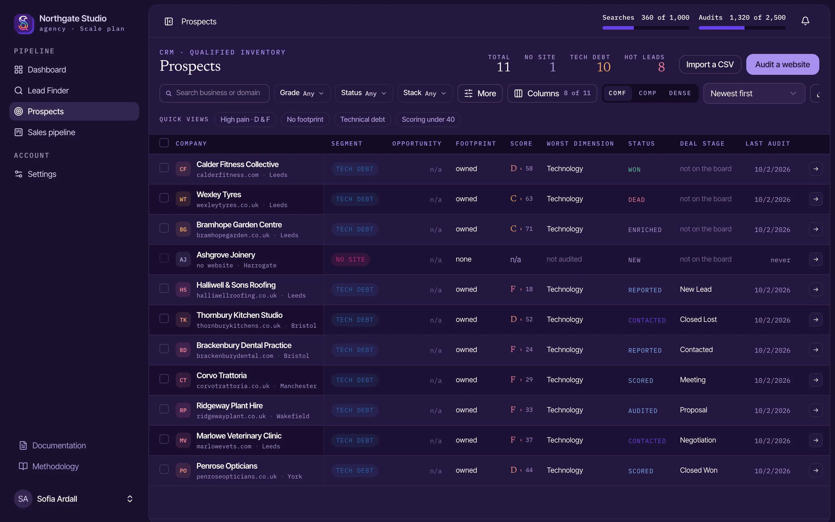
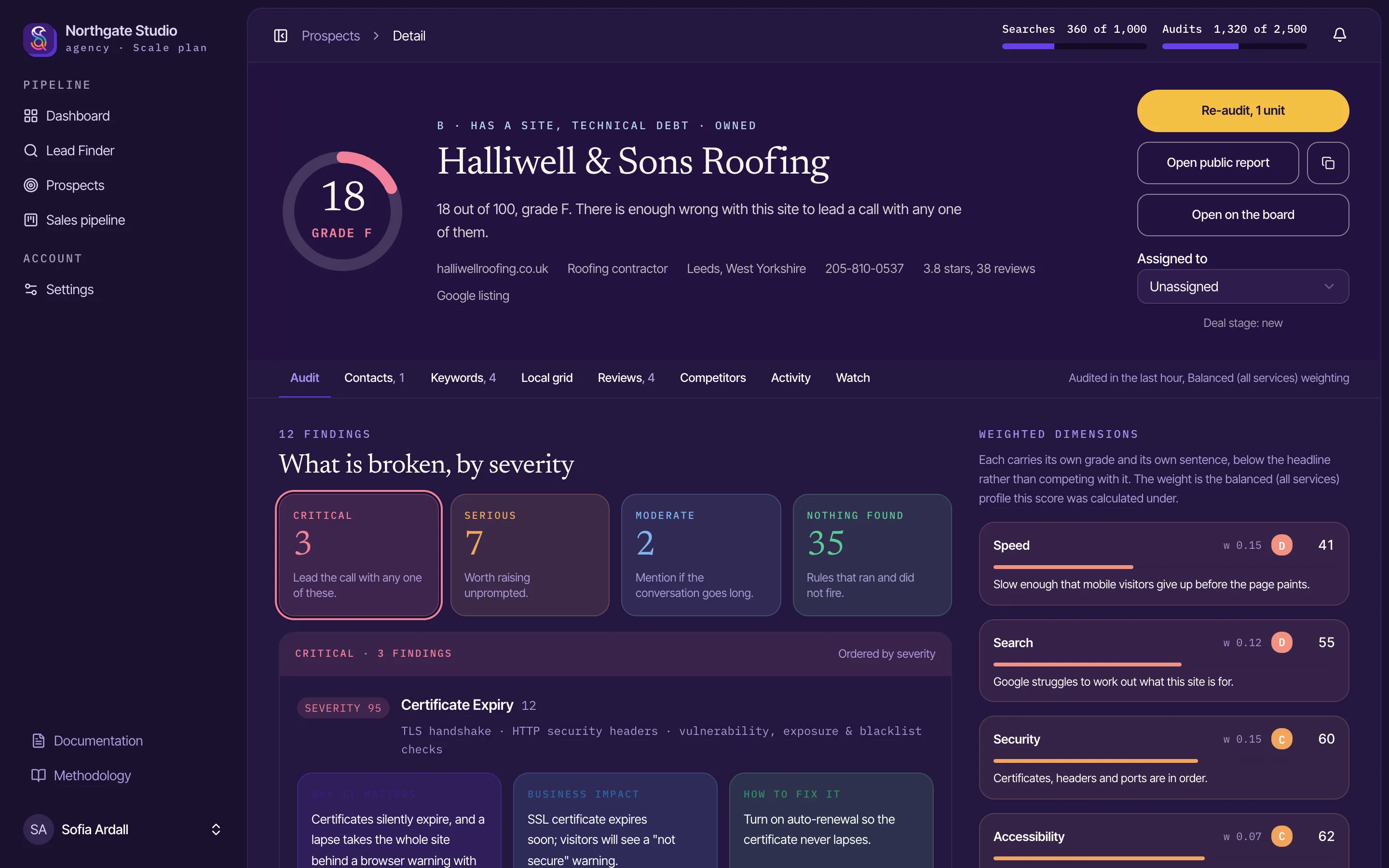
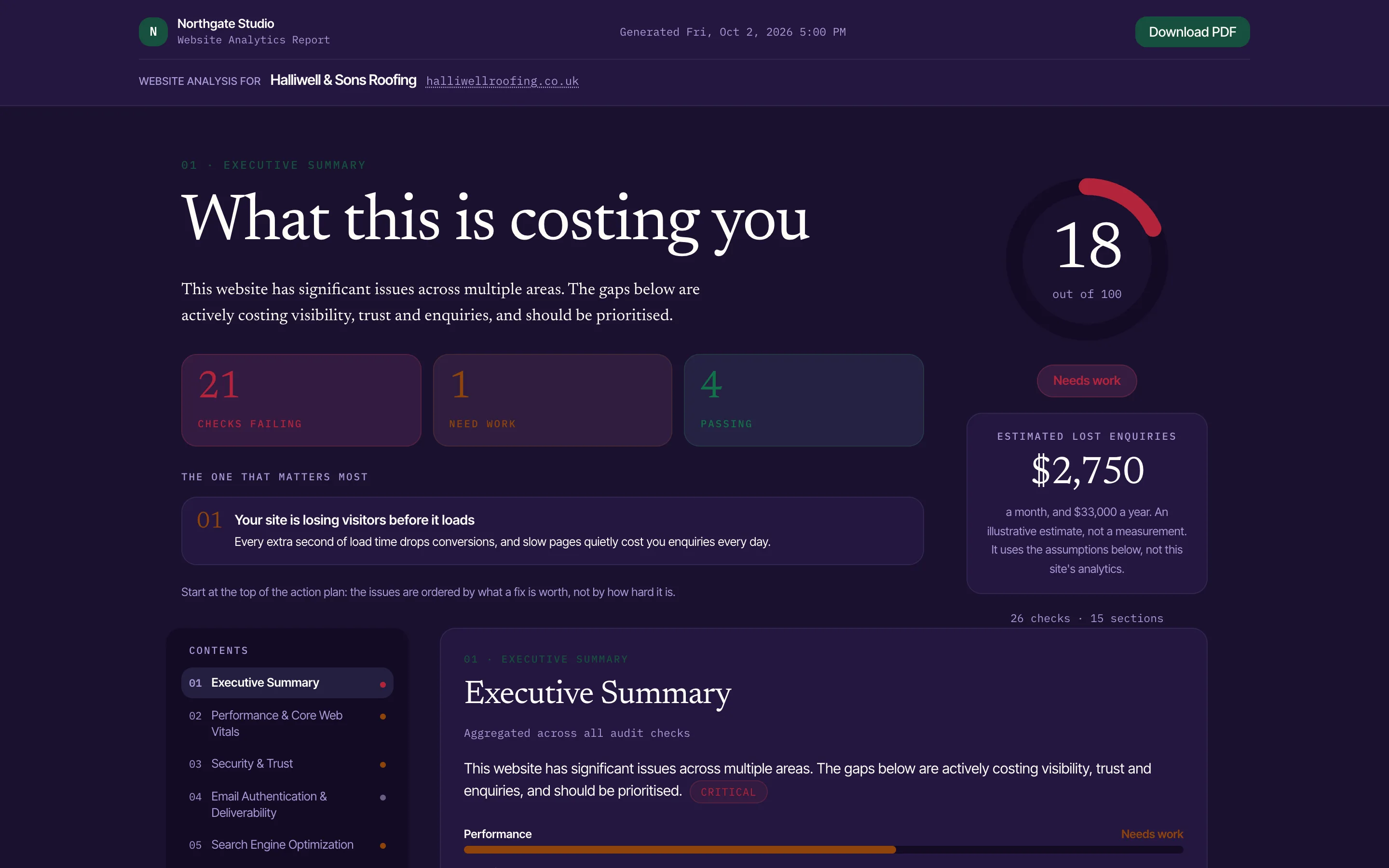
Screenshots of the application with a demo agency's data, at twice screen resolution. Each comes in light and dark; the page shows whichever matches your system. Please do not crop out the interface chrome or alter the figures on screen.
Guidelines
The logo works because it is always drawn the same way. Use the files on this page as they are, and if a placement needs something they do not cover, ask us first.
Download the logo from this page rather than redrawing it, tracing it or taking it from a screenshot.
The primary lockup on light grounds, the dark lockup on night, the on-violet lockup on brand violet, and one colour where only one ink is available.
SiteAssay, with a capital S and a capital A. Never Site Assay, Siteassay or Site-Assay.
Downloads
The logo, the stacked logo, the mark, the wordmark and the app icon, each as SVG and as a high-resolution PNG, in every colour version.
Download the brand kit ZIP, 544 KB